Find the latest articles on our Growth Blog and Product Blog.
Growth Blog | Product Blog
 André Gauci wrote this on April 07, 2025
We’re excited to introduce a series of robust updates that elevate productivity with new tracking, list enhancements, and data visualization tools.
Our team has been working diligently to refine these features, ensuring that your workflows are more efficient and your data insights more actionable.
Explore how these new improvements empower you to monitor progress, manage lists effortlessly, and achieve clearer, more dynamic reporting.
The Progress Tracker Widget brings a dynamic way to visualize goals with two styles – a round tracker and a classic progress bar.
You can set constant target values or use conditions for dynamic targets, making it easy to monitor performance toward specific objectives.
Below is a video showcasing how it works:
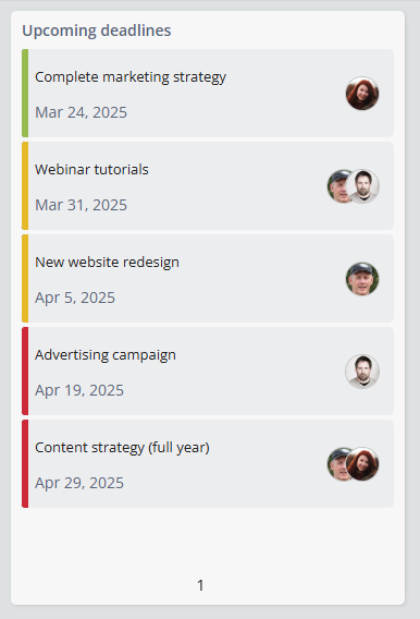
We’ve rolled out several updates to the Sorted List widget, bringing a more polished visual experience and improved usability for list-based displays.
You can now apply color formatting by selecting a select field and using its color formatting. This makes it easier than ever to create visually distinct, informative lists.
The Sorted List widget now allows you to display the user field for each item, which wasn’t previously an option. This lets you quickly identify the users involved in each list item, without showing them all at once. Hovering over the field will reveal the full user names for easy identification.
You can also include fields from referenced Apps directly in the title.
Finally, the UI has been refined to feel more modern and responsive. You can now also select a field as a prefix or suffix instead of just using static text.
We’ve added a powerful new Loop action to workflows, designed to give you greater flexibility when automating processes across multiple records and actions.
In a nutshell, by using the Loop Action you can loop through related records (e.g. tasks). Within this loop, actions can be performed on each individual task being looped. Previously, actions could only be performed on the record (e.g. a project) that triggered the workflow.
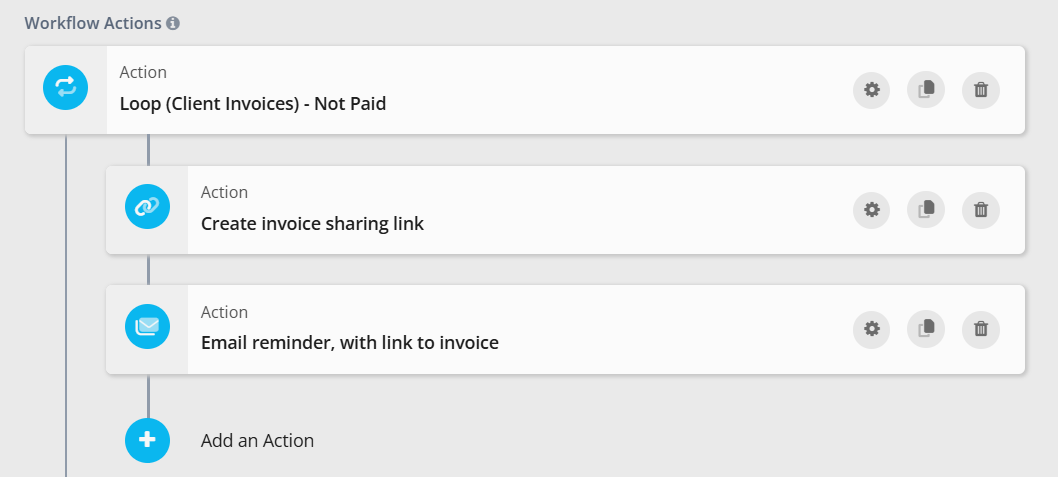
Email and notification steps have also been improved. You can now use dynamic values for TO, CC, BCC, subject, body, and attachments - making messages more personalized and context-aware.
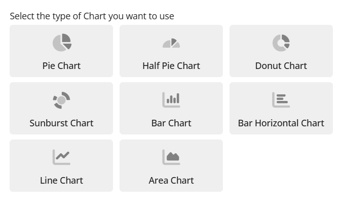
We’ve added a collection of new chart widgets designed to bring more flexibility and clarity to your data visualization toolkit.
The Sunburst Widget offers a fresh way to visualize hierarchical data, using concentric rings to display inner and outer groupings. It’s perfect for exploring nested relationships at a glance, all in a compact circular format.
The Half Pie Chart layout is a space-saving option for simpler datasets. By displaying only half of a full pie, it’s ideal for dashboards where space is limited but quick insights are still key.
With this update, it is also much easier to switch between different types of charts.
We’ve added inline editing for related records in both Grid View and Badge View, making it easier than ever to manage app references directly within your lists.
With this update, you can edit reference fields on the spot using a convenient dropdown selector.
Quick create is now available in the calendar! In the Month view of the calendar, you can either click on a day and drag to establish a range, or click the plus sign that appears when you hover over it. In Week view, a plus sign has been added to the header. In the Day view, you can click or drag on the calendar to create a record.
We hope you enjoy the latest updates!
As always, if you have any feedback or find any issues, let us know via 💬 or 📧